|
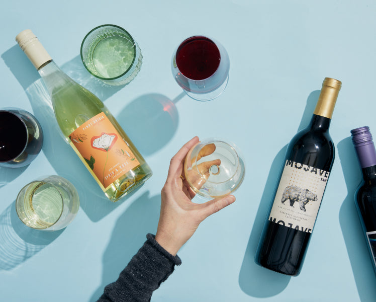
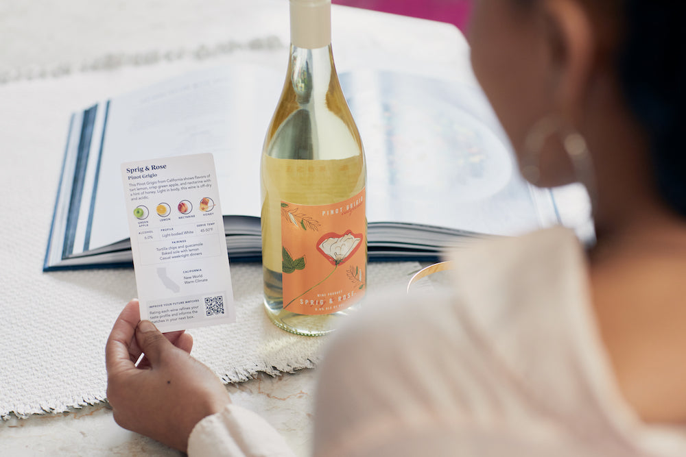
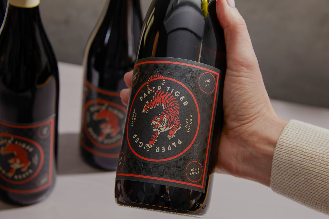
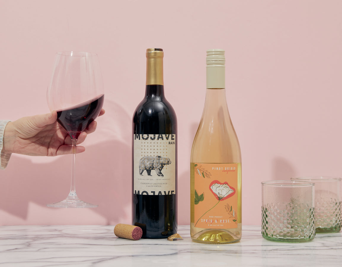
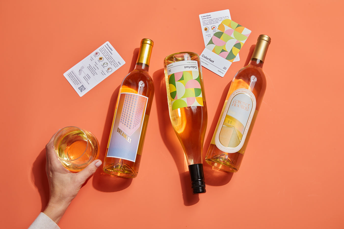
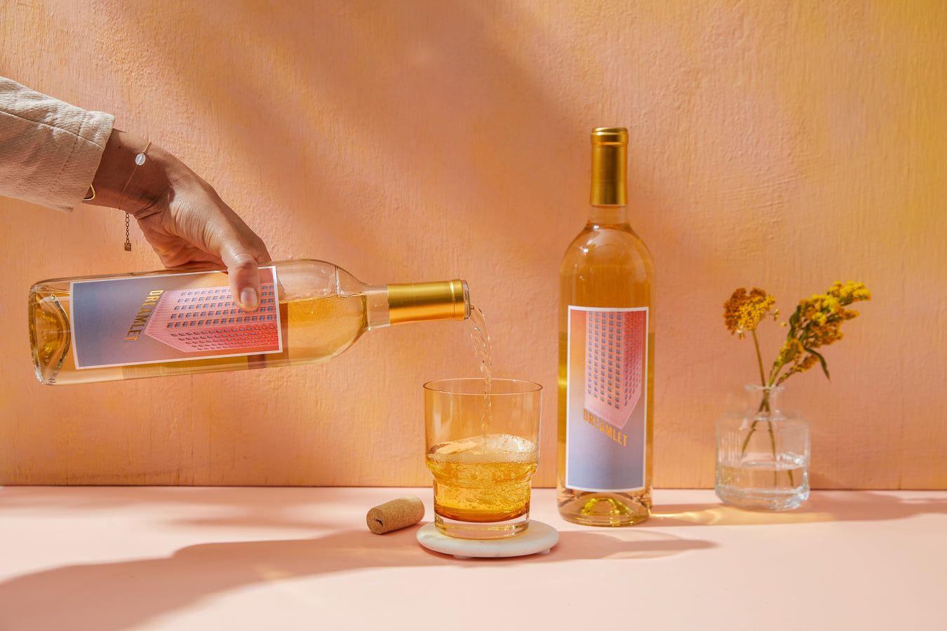
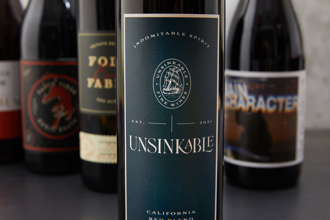
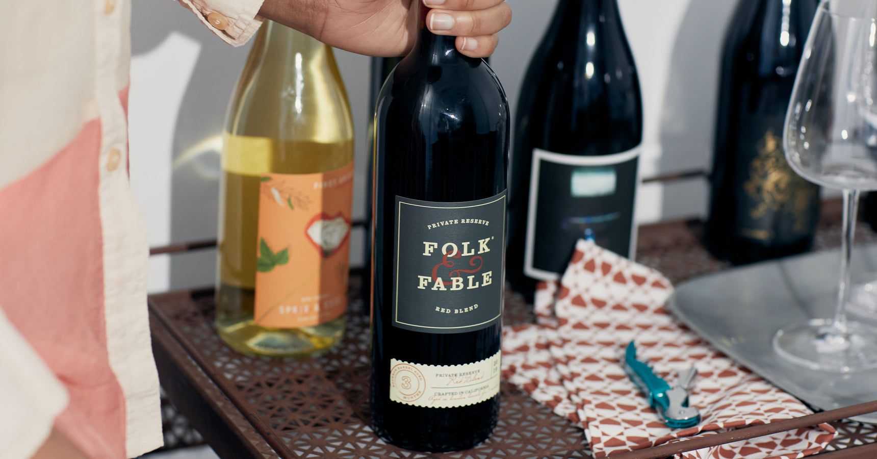
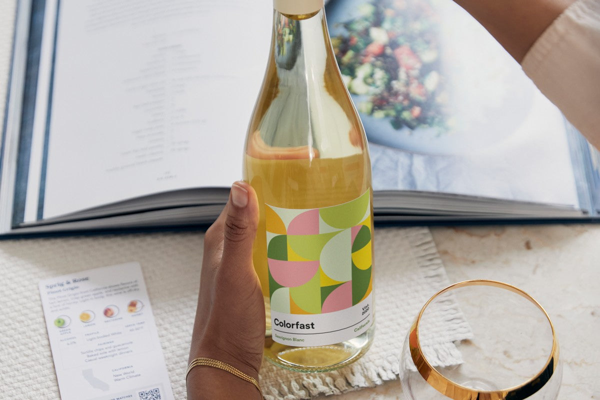
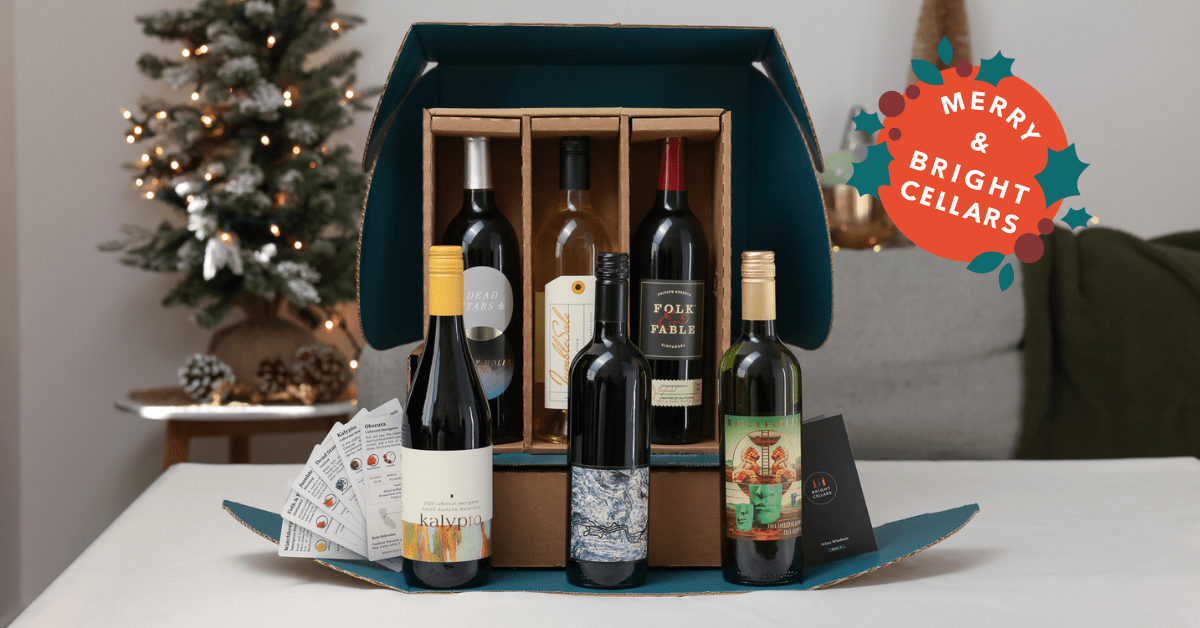
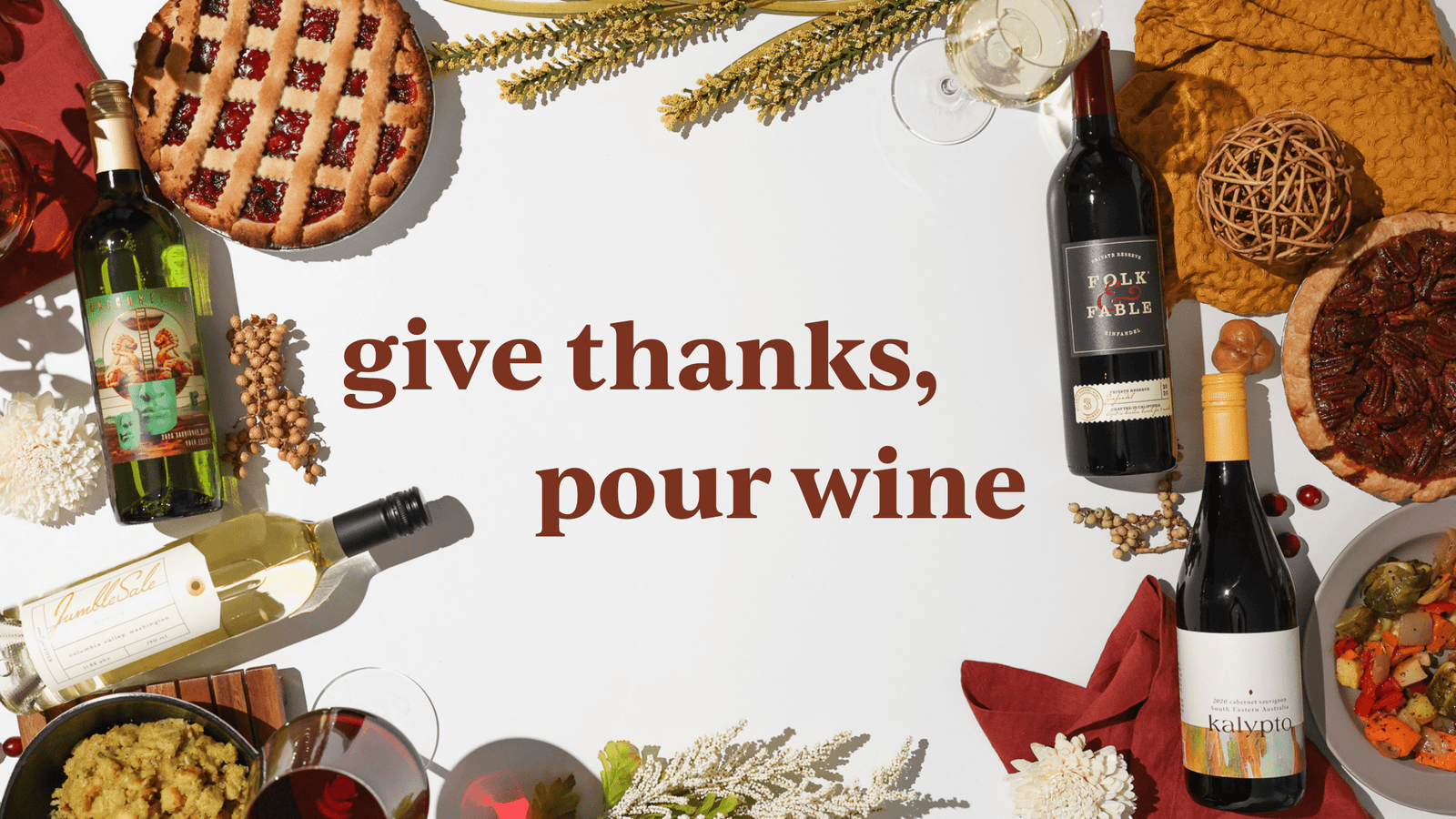
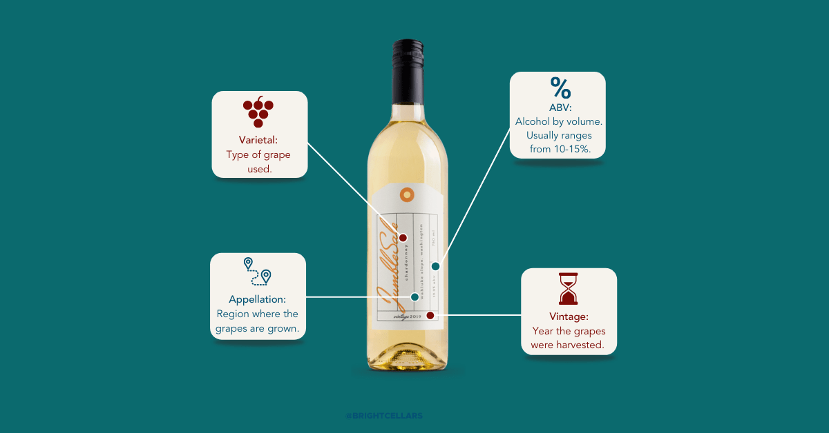
We’ve all been there. You’re walking down the wine aisle, intimidated and not sure what to get. You may know whether you prefer reds or whites, but beyond that, you’re pretty open to trying anything. So, how do you decide which one of the many wines on the shelf is the best choice? It’s a tricky decision, I know. What makes it slightly easier is that beautiful label calling to you from the shelf. In a matter of seconds your brain forms an opinion about the design. Do you like it? Does it draw you in, begging you to pick it up off the shelf and take a closer look? The label is the first interaction you have with the wine.Design sets the mood. It prompts you to start forming your opinion about what’s inside the bottle before you can even swirl, sniff and sip. Is this fair to the wine? Not always. Is this fun for a designer? You betcha. So, what goes into such an important design? So glad you asked. I’ve outlined my process into four distinct steps: Research, Evaluate, Iterate and Refine. (You’re welcome.) |
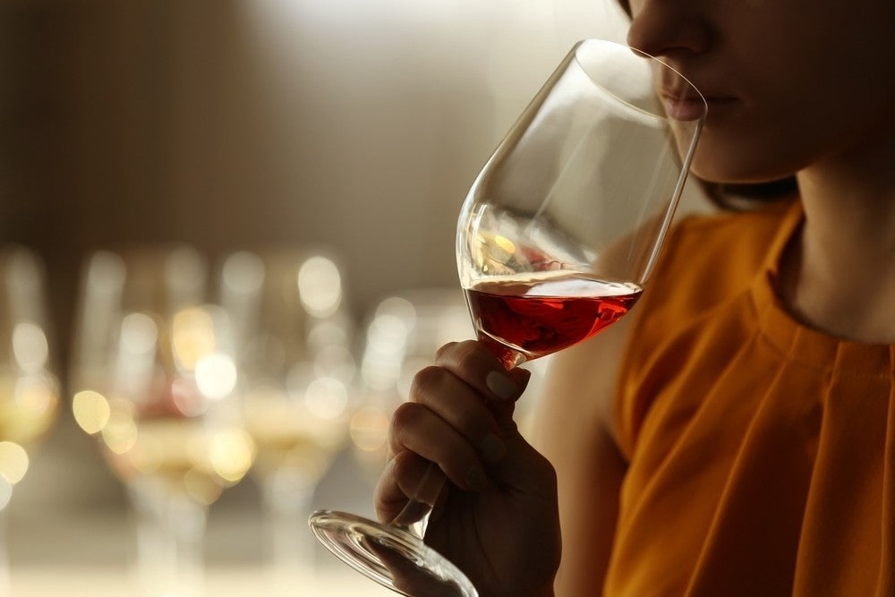
Research.As a designer, the research phase is where I find inspiration both conceptually and visually. I start to explore where the wine came from including the culture, history and people or landmarks of that region. This is one of my favorite parts of the process. The opportunity to learn about cultures and people all around the world is incredibly exciting. With every new brand, I embark on a new adventure.Taking a step away from the screen, I taste the wine to identify characteristics which influence color choices and the overall experience I envision for this design. Evaluate.Once I’ve gathered a collection of unique information, I work with the wine and design team to narrow down the strongest directions. This is the point where our team starts to brainstorm potential names for the brand. As the designer, I draft sketches based on the chosen direction or names. The adventure then begins to take shape and really comes to to life. |
Iterate.I sketch and I sketch and I sketch. Then I have a little wine. Then I sketch some more...you get the idea. Through this process, I find what naturally seems to click with my vision for the brand. I begin to translate my sketches on paper to my screen. A grid is created and colors and typefaces come out to play. Typically, two or three strong directions are developed from this process. The team then picks the most successful design from these options and I fine-tune it. |
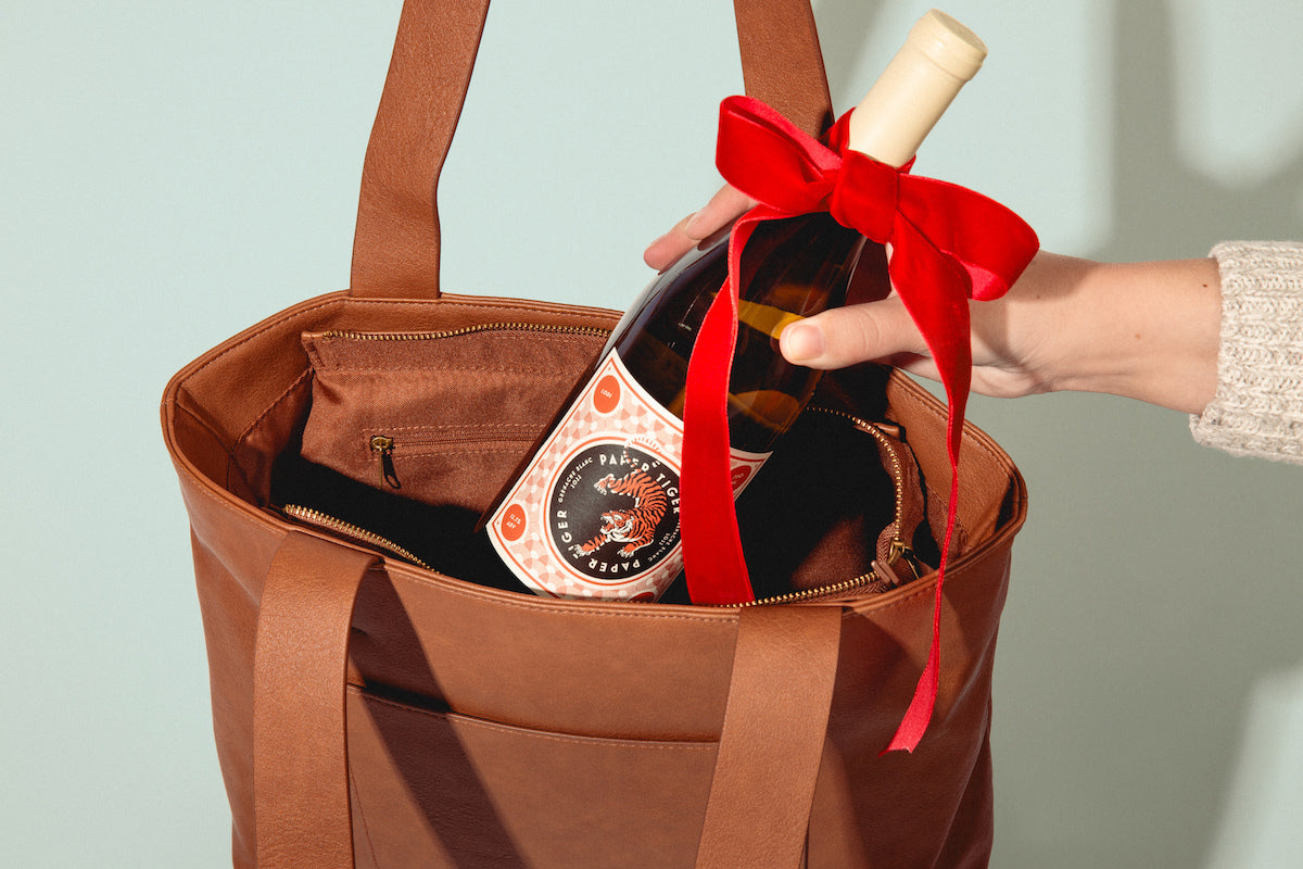
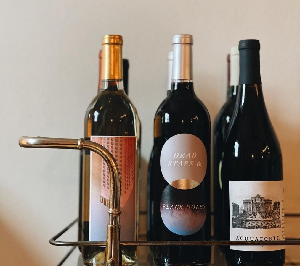
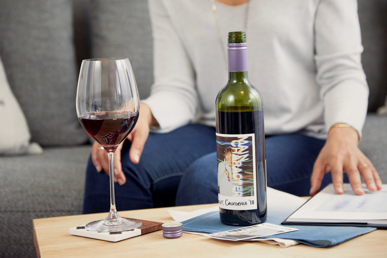
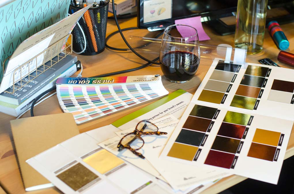
Refine.We now have our most successful label designed and it’s time for the finishing touches. This is when decisions about paper type, foil and capsule color are finalized. What about this design makes it stand out from the rest? What is the experience we are aspiring for? How does it appear in the store, on a wine rack or an artfully designed Instagram shot? So there you have it, my secrets are out. The next time you’re walking down the wine aisle, admire all of the hard work that went into those designs and the story that each bottle tells. Maybe, just maybe, the wine will live up to the label. |
